The purpose of your brochure may differ from business to business. Some
are designed to display services, whereas others are focused on selling
an idea.
No matter what the focus of the brochure is, it needs
to be readable, intriguing, and functional. The brochure must grab a
viewer's attention and hold it long enough to deliver the pertinent
information.
How do you grab your customers' attention with just a piece of paper?
You could try by giving the viewer a paper cut, but that's not the kind of attention you want, is it?
Seriously
though, with so many brochures out there, how do you stand out? The
answer is quite simple. Make sure your brochure is professionally
designed, written, and printed.
Here are some tips to keep in mind when you hire a freelancer or agency to design your brochure:
Text
is the key. Anyone can write copy, but only a skilled copywriter can
write easy-to-read, strong sentence structures that articulate your
company's message. Wouldn't you rather go to a specialist?
Question
all. No matter who is writing your copy, make sure the headline on the
front of the brochure is in the form of a question. This question should
make the viewer want to open the brochure to learn more.
Focus on a problem that is most common in your target industry then tie it directly to a solution you provide your clients.
Color
matters. Stay in tune with your corporate colors. This will help keep
an overall brand image in tact as well as strengthen the brand.
Type Issues. Typography should be relevant and thought out. Type is so strong that it can make or break a brochure.
Stay away from typical fonts and try to stand out from other brochures in your field.
Picture
This. If you do not need pictures to articulate a message, then do not
use them. Most of the time people are prone to use so many pictures in a
brochure, they don't realize they are clouding their message and making
their brochure ineffective.
Pictures are great, especially when
relevant, but they draw reader's eyes away from the copy which you have
spent so much time perfecting. So, use pictures with taste and if at
all possible, don't use them at all.
If you try to cut corners on
your brochure you will end up spending more money down the road when
you have to get it redesigned. Make sure you do it right the first time,
and you will have a brochure that helps you make the biggest return on
the investment.
Langganan:
Posting Komentar (Atom)
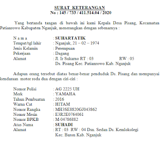
SURAT KETERANGAN STNK DAN BPKB untuk Hutang BANK
Surat ini biasanya untuk melengkapi administrasi pengajuan hutang ke Bank, biasanya juga disertai dengan SURAT KETERANGAN USAHA . monggo bi...

-
Alhamdulillah akhirnya AJ bisa post lagi......... lama juga AJ gk post. Langsung saja kali ini AJ akan berbagi pengalamn tentang bagaimana ...
-
Kali ini saya akan berbagi pengalaman bagaimana cara mengatasi Printer Dotmatix Epson LQ 2180 lampu pause menyala terus........ kalau lam...
-
Berikut ini bagaimana cara mengatasi printer canon ip 2770 eror B200.. kebanyakan dari agan-agan yang posting mungkin menerangkan kalo ero...


Tidak ada komentar:
Posting Komentar